The second way was what was called “Geometric” drawing. You still needed a pencil and a piece of paper, but also a drawing board and a tee square, and probably also a pair of compasses, protractor, dividers, etc. If you needed to create a neat, precise drawing, this was the way to achieve it.
My grandfather had been a professional draughtsman [British English spelling, and, yes, it is pronounced “draftsman”!] for the City of Leeds, and that was the way he produced drawings too. I still have a few of his drawing tools, including a pair of brass compasses that pivot around a soldered-on gramophone needle!
Another useful tool for geometric drawing was a set of stencils. These were wooden or plastic templates, offering regular shapes that you could draw around or inside. For example, even the best artists have difficulty drawing an exact circle freehand, so circle templates were useful when these were needed.
These days, of course, I suspect that almost nobody still does geometric drawing with a board and tee square, just because it’s easier to produce the same results, or better, using computers.
When I made the switch from pencil-and-paper drawing to computer artwork generation, I was initially confused about how to translate the techniques I’d learned. Was there a computer equivalent of a pair of compasses, a protractor, and so on? Although there are in fact such equivalents, they’re not necessarily the best way to go about producing a drawing. It took me much time and practice before I learned the best ways to translate conventional geometric drawing techniques into their digital equivalents.
Although I did considerable online research, and bought books on the subject, I was never able to find a tutorial providing a general approach to this kind of drawing problem. Everything I found was either very abstract, or else was a specific set of instructions to enable you to draw “exactly what I already drew”. I didn’t find any of that particularly useful, so I’m offering this post in the hope that it may, in a small way, fill that void for aspiring computer artists.
Creating a Gear Icon
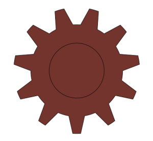
Recently, I needed to produce a “gear icon” drawing for some computer documentation. This type of icon is quite popular these days for the identification of “Settings” controls in software, in a linguistically neutral way. The end result I had in mind was to be as shown below.
The tool I’d be using was Corel Draw (similar to Adobe Illustrator), which produces vector drawings. The advantage of vector drawing over bitmap painting (as would be produced by Adobe Photoshop) is that you can draw your original at any scale, and re-scale your final image to any size without loss of resolution. (A vector drawing records shapes as sets of mathematical equations, rather than color values in a matrix of pixels.)
So, how to go about producing this icon? One fact about computer artwork that I learned early on was that there are many ways to produce the same output, so it becomes a question of choosing the most efficient way to produce the result that you want.
It also pays to make maximum use of your software’s built-in drawing “primitives” whenever you can. Any credible vector drawing package includes controls for drawing such basic shapes as rectangles, circles, etc., and most include controls to produce more sophisticated shapes.
To produce the gear icon, I could have drawn out every curve individually, then tried to tweak the result until it was correct, but this would be incredibly slow, and likely produce an imperfect result. Alternatively, I could have started with a circle, then created a “tooth” shape, and attached rotated copies of the tooth to the circle, but this again seemed like a lot of work!
An Efficient Method
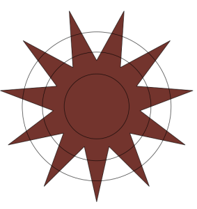
Of the available primitive shape controls, the Star tool seemed to produce a result that had the greatest resemblance to my desired result (Adobe Illustrator offers a very similar Star tool). So, I selected the Star tool and drew a regular, 11-point star, as below. The exact proportions of the star didn’t matter in this case, so I just “eyeballed” them. (The fill color used in these samples is for clarity only; you can use any fill type, or none at all.)
Now I had to trim and modify the basic star shape to make it look more like a gear.
Next, I used the Ellipse tool to draw 3 concentric circles over the star, and centered all the objects vertically and horizontally, as below. The exact diameters of the circles didn’t matter. All that mattered was that the diameter of the outermost circle should be less than that of the star, and the diameters of the other two circles should be respectively larger and smaller than the inner portion of the star, as shown.
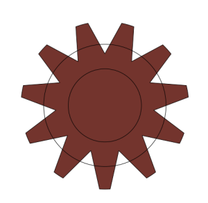
Now, I opened Corel Draw’s Shaping menu to begin combining the basic shapes. Firstly, I selected the outermost circle and used the Intersect control in the Shaping menu to lop off the points of the star, with the result below.
Next, I selected the outermost remaining circle (above), and used the Weld control in the Shaping menu to merge it with the remains of the star. This “filled in” the inner vertices of the star, to create the gear’s “bottom land”, as below.
Finally, it was just a question of using the innermost (remaining) circle to punch out the hole in the center. I achieved this by selecting the inner circle, then using the Trim tool in the Shaping menu to remove the center from the remains of the star shape.
Final Drawing
The end result was exactly the shape that I wanted. I’m now able to recolor and resize this vector shape for whatever application I need. Below is an example of the icon applied to a fictitious software button.
Just to demonstrate that the hole in the center of the gear icon really is a hole and not an opaque circle, below is an example of the gear icon laid over a bluish square in Corel Draw. The square is covered by the red portion of the icon, but shows through the hole in its center.
I suppose that there’s an element of “lateral thinking” in these designs, in the sense that you have to start by thinking about the desired end result, then work backwards from there to the primitive shapes supplied by the drawing tool.
In my next post, I plan to discuss how to use computer-aided techniques to assist the production of more “conventional” artwork.

