Is this the end of the Age of Monochrome Illustration?
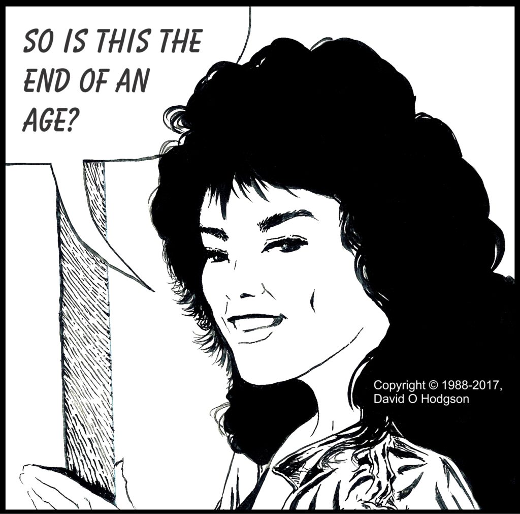
I painted the illustration frame above many years ago using the “standard” comic strip technique; black ink applied onto white card with a brush. At the time, I gave no thought to the idea that that technique might become outdated, and even within my own lifetime.
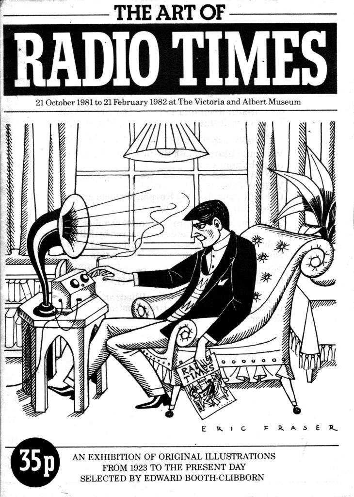
I first learned to use the brush-and-ink technique myself while at university, although I received no formal training in it. I basically figured it out by making several visits to an exhibition of illustrative artwork that displayed work done for the BBC’s house magazine Radio Times. The exhibition took place at the Victoria & Albert Museum, which was just around the corner from Imperial College, and thus was very convenient for me. The front cover of the exhibition catalog is shown below.
Following that exhibition, my first attempt to use the brush-and-black-ink technique was to illustrate a poster for a lecture titled The Psychology of Gambling. My poster illustration is shown below.

It was also my responsibility to prepare the print masters for my posters. When preparing the master for the poster above, I learned a valuable lesson about the use of solid expanses of black! Although they do make for a striking design, half-screen reproduction processes didn’t handle them well, so they were best avoided in those days. (Modern printing techniques are less prone to this kind of problem, but it’s still something to bear in mind.)
Ian Ribbons
Recently, I wrote an article about my experiences in an Illustration class that I took at St. Martins School of Art, London, way back in 1982. My tutor for that class was Ian Ribbons, who (unbeknown to me at that time) was a fairly famous British illustrator. (I find it sobering to reflect that he may have been the only art teacher I ever had who was a noted artist in his own right.) My experience in that class, and Mr. Ribbons’ guidance, were immensely helpful to me in developing my own styles and approaches to art projects.
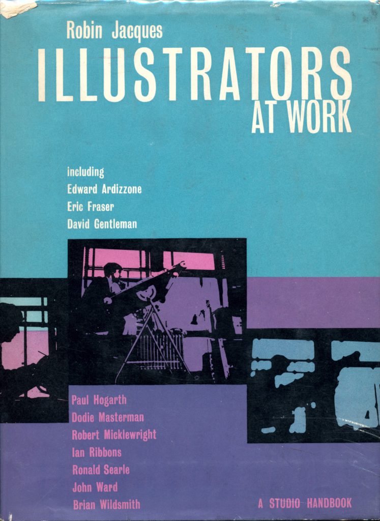
Years later, while browsing in a secondhand bookshop, I came across a copy of a 1963 book by another famous British illustrator, Robin Jacques, in which he compiled biographies and work samples of many contemporary artists (one of whom was Ian Ribbons, which was what drew my attention to the book). The book is called Illustrators at Work, and the front cover is shown below.
Monochrome vs. Black-and-White
The notable but unspoken common characteristic of every art sample in the Illustrators at Work book is that it is not only shown in monochrome (or grayscale in computer terms), but was specifically produced for monochrome-only reproduction.
(Such artwork is typically called “black and white”, but that’s not strictly accurate because much of it includes shades of gray. Here, I’ll use “black and white” to refer only to artwork that literally uses only those two colors, and does not include grays. I’ll use “monochrome” to refer to artwork that consists of gradations from one color—usually black—to white.)
That fact made me think about how much art, illustration and reproduction methods have changed during my lifetime. For most of the twentieth century, it was taken for granted that most artwork for printed reproduction would be monochrome, primarily for economic and technical reasons. Most books, newspapers and magazines were printed entirely or mostly using only black ink, so there was no possibility of reproducing anything in color.
Why Does Monochrome Work?
I notice that very few people stop to consider why we accept some monochrome images as being valid two-dimensional representations of a scene, when we would not accept certain other kinds of monochrome images.
For example, for many years most photographs were monochrome (“black and white”). Provided that the grayscale in the image corresponds to that of the actual scene, the human brain accepts it as valid and can interpret the content, for example by recognizing a face.
However, if the grayscale in the image does not correspond to that in the real scene, the brain cannot interpret it correctly. For example, if shown a monochrome photographic negative, most people would have difficulty identifying a face that they would immediately recognize if shown the corresponding positive image.
Why is this the case?
I described in a previous post how the human visual system relies on various types of light receptor cells within our eyes. One type are called “Rods”, and these provide us with monochrome vision in low light conditions. It is because of this ability that we accept a monochrome image as being a valid representation of a scene; our brains just assume that we’re looking at something in low light.
Reproduction of Illustrations
Until the twentieth century, illustrations that were intended for printed reproduction were often produced using intaglio techniques. This involved the creation of the illustration by literally incising lines onto a metal or wood surface, and thus all shading had to consist of patterns of lines or dots. Perhaps one of the most famous masters of this technique was Sir John Tenniel, who illustrated Lewis Carroll’s “Alice in Wonderland” and similar works.
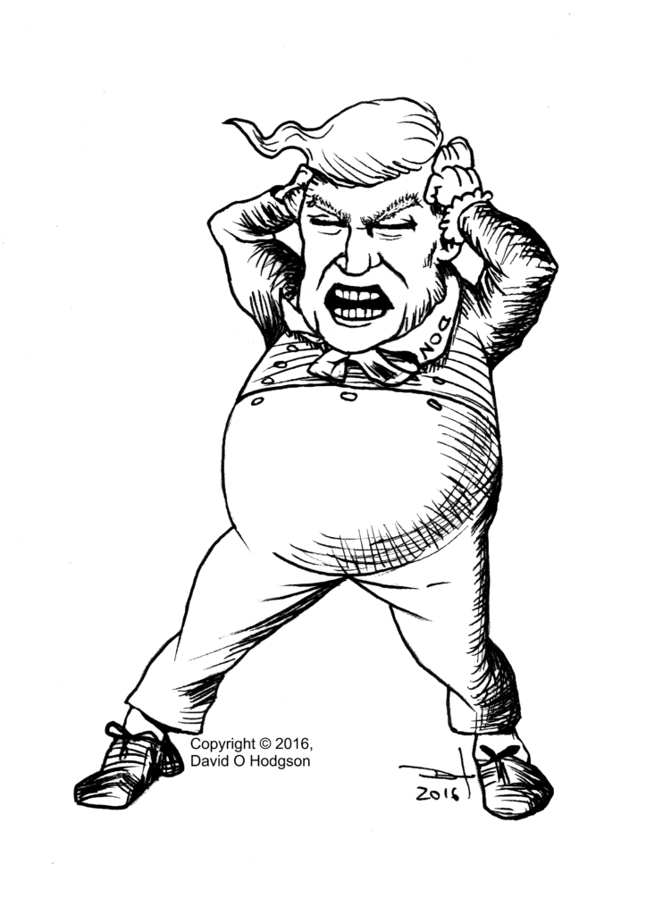
Last year, I parodied Tenniel’s style to produce a satirical image of a well-known politician throwing a characteristic temper tantrum. Tenniel’s original images of Tweedledum and Tweedledee, which inspired my image, were woodblock cuts, but mine is a pen-and-ink drawing.
Limitations Stimulate Creativity
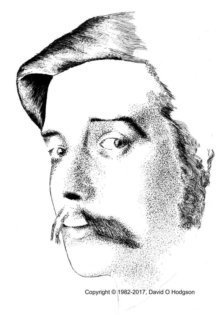
The restriction to a single color, and the inability to print continuous shades of even that one color, forced artists to develop many sophisticated drawing techniques that used black and white patterns to simulate continuous tones, such as cross-hatching and stippling.
My Tenniel parody above shows samples of cross-hatching, whereas the image below shows a sample of stippling, in my never-finished portrait of the young H G Wells.
I mentioned above one artist who excelled in such techniques, Robin Jacques. His artwork has appeared in many children’s books and is justly world-famous. Another master of the art was Eric Fraser, whose work appears on the cover of the Art of Radio Times exhibition catalog shown above.
Frank Patterson’s Linework
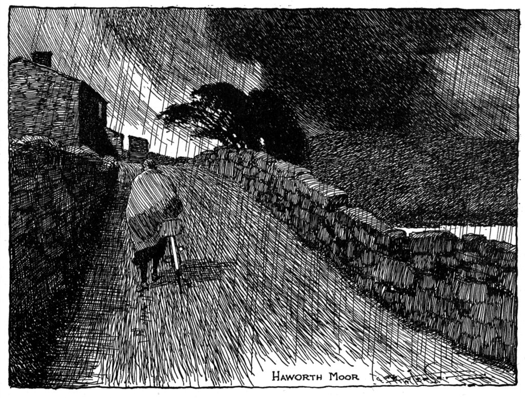
A less famous artist who excelled in monochrome illustration, and particularly in the use of linework, was Frank Patterson, most of whose work was produced for British cycling magazines from the 1920s through the 1940s.
The illustration of a road across Haworth Moor (shown below) is a spectacular sample of how Patterson could create a dynamic and emotive scene merely from black lines. This is clearly one of those cases where a photograph of the scene would probably be far less effective than the artist’s imaginative creation.
Conclusion: The Brave New World of Full-Color Illustration
As I mentioned above, the situation now is that, in most publications, there are no restrictions on color reproduction at all. Every image can be reproduced in full color at no additional cost, relative to monochrome reproduction.
While this opens up new creative possibilities for artists, it does mean perhaps that we will never again see the development of ingenious new techniques for monochrome artwork.

