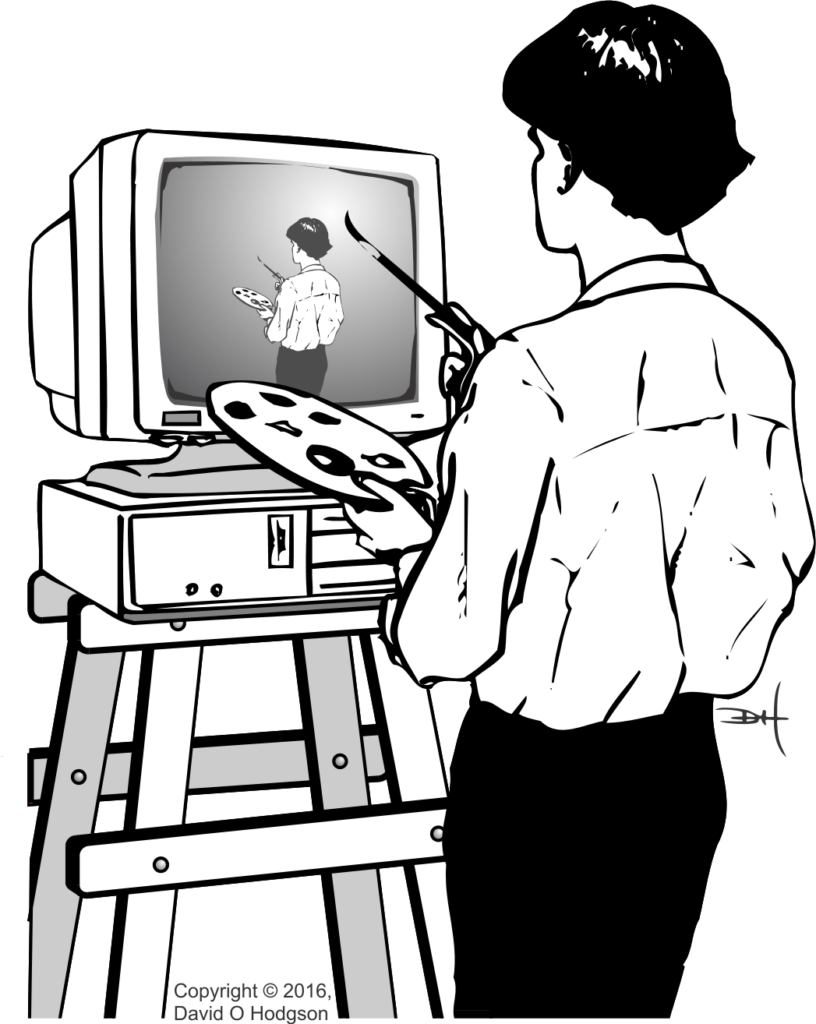
The word “palette” (or “pallet”) has several meanings: it can refer to a tray used to transport items, or to a board used by artists to mix colors (as shown in the fantasy illustration above, which I produced many years ago for a talk on Computer Artwork). In this article, I’ll discuss the principles of Digital Color Palettes. If you’re working with digital graphics files, you’re likely to encounter “palettes” sooner or later. Even though the use of palettes is less necessary and less prevalent in graphics now than it was years ago, it’s still helpful to understand them, and the pros and cons of using them.
Even within the scope of digital graphics, there are several types of palette, including Aesthetic Palettes and Technical Palettes.
I discussed the distinction between bitmap and vector representations in a previous post [The Two Types of Computer Graphics]. Although digital color palettes are more commonly associated with bitmap images, vector images can also use them.
The Basic Concept
A digital color palette is essentially just an indexed table of color values. Using a palette in conjunction with a bitmap image permits a type of compression that reduces the size of the stored bitmap image.
In A Trick of the Light, I explained how the colors you see on the screen of a digital device display, such as a computer or phone, are made up of separate red, green and blue components. The pixels comprising the image that you see on-screen are stored in a bitmap matrix somewhere in the device’s memory.
In most modern bitmap graphic systems, each of the red, green and blue components of each pixel (which I’ll also refer to here as an “RGB Triple” for obvious reasons) is represented using 8 bits. This permits each pixel to represent one of 224 = 16,777,216 possible color values. Experience has shown that this range of values is, in most cases, adequate to allow images to display an apparently continuous spectrum of color, which is important in scenes that require smooth shading (for example, sky scenes). Computers are generally organized to handle data in multiples of bytes (8 bits), so again this definition of an RGB triple is convenient. (About twenty years ago, when memory capacities were much smaller, various smaller types of RGB triple were used, such as the “5-6-5” format, where the red and blue components used 5 bits and the green component 6 bits. This allowed each RGB triple to be stored in a 16-bit word instead of 24 bits. Now, however, such compromises are no longer worthwhile.)
There are, however, many bitmap images that don’t require the full gamut of 16,777,216 available colors. For example, a monochrome (grayscale) image requires only shades of gray, and in general 256 shades of gray are adequate to create the illusion of continuous gradation of color. Thus, to store a grayscale image, each pixel only needs 8 bits (since 28 = 256), instead of 24. Storing the image with 8 bits per pixel (instead of 24 bits) reduces the file size by two-thirds, which is a worthwhile size reduction.
Even full-color images may not need the full gamut of 16,777,216 colors, because they have strong predominant colors. In these cases, it’s useful to make a list of only the colors that are actually used in the image, treat the list as an index, and then store the image using the index values instead of the actual RGB triples.
The indexed list of colors is then called a “palette”. Obviously, if the matrix of index values is to be meaningful, you also have to store the palette itself somewhere. The palette can be stored as part of the file itself, or somewhere else.
To restate, whether implemented in hardware or software, an image that uses a palette does not store the color value of each pixel as an actual RGB triple. Instead, each color value is stored as an index to a single entry in the palette. The palette itself stores the RGB triples. You specify the pixels of a palettized* image by creating a matrix of index values, rather than a matrix of the actual RGB triples. Because each index value is significantly smaller than a single triple, the size the resulting bitmap is much smaller than it would be if each RGB triple were stored.
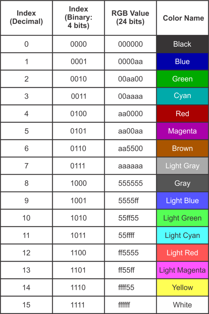
The table below shows the index values and colors for a real-world (albeit obsolete) color palette; the standard palette for the IBM CGA (Color Graphics Adapter), which was the first color graphics card for the IBM PC. This palette specified only 16 colors, so it’s practical to list the entire palette here.

(* For the action associated with digital images, this is the correct spelling. If you’re talking about placing items on a transport pallet, then the correct spelling is “palletize”.)
Aesthetic Palettes*
In this context, a palette is a range of specific colors that can be used by an artist creating a digital image. The usual reason for selecting colors from a palette, instead of just choosing any one of the millions of available colors, is to achieve a specific “look”, or to conform to a branding color scheme. Thus, the palette has aesthetic significance, but there is no technical requirement for its existence. The use of aesthetic palettes is always optional.
(* As I explained in Ligatures in English, this section heading could have been spelled “Esthetic Palettes”, but I personally prefer the spelling used here, and it is acceptable in American English.)
Technical Palettes
This type of palette is used to achieve some technological advantage in image display, such as a reduction of the amount of hardware required, or of the image file size. Some older graphical display systems require the use of a color palette, so their use is not optional.
Displaying a Palettized Image
The image below shows how a palettized bitmap image is displayed on a screen. The screen could be any digital bitmap display, such as a computer, tablet or smartphone.

The system works as follows (the step numbers below correspond to the callout numbers in the image):
- As the bitmap image in memory is scanned sequentially, each index value in the bitmap is used to “look up” a corresponding entry in the palette.
- Each index value acts as a lookup to an RGB triple value in the palette. The correct RGB triple value for each pixel is presented to the Display Drivers.
- The Display Drivers (which may be Digital-to-Analog Converters, or some other circuity, depending on the screen technology) create red, green and blue signals to illuminate the pixels of the device screen.
- The device screen displays the full-color image reconstituted from the index bitmap and the palette.
Hardware Palette
In the early days of computer graphics, memory was expensive and capacities were small. It made economic sense to maximize the use of digital color palettes where possible, to minimize the amount and size of memory required. This was particularly important in the design of graphics display cards, which required sufficient memory to store at least one full frame of the display. By adding a small special area of memory on the card for use as a palette, it was possible to reduce the size of the main frame memory substantially. This was achieved at the expense of complexity, because now every image that was displayed had to have a palette. To avoid having to create a special palette for every image, Standard color palettes and then Adaptive color palettes were developed; for more details, see Standard vs. Adaptive Palettes below.
One of the most famous graphics card types that (usually) relied on hardware color palettes was the IBM VGA (Virtual or Video Graphics Array) for PCs (see https://en.wikipedia.org/wiki/Video_Graphics_Array).
As the cost of memory has fallen, and as memory device capacities have increased, the use of hardware palettes has become unnecessary. Few, if any, modern graphics cards implement hardware palettes. However, there are still some good reasons to use software palettes.
Software Palette
Generally, the software palette associated with an image is included in the image file itself. The palette and the image matrix form separate sections within one file. Some image formats, such as GIF, require the use of a software palette, whereas others, such as BMP, don’t support palettes at all.
Modern bitmap image formats, such as PNG, usually offer the option to use a palette, but do not require it.
Standard & Adaptive Palettes
Back when most graphics cards implemented hardware palettes, rendering a photograph realistically on screen was a significant problem. For example, a photograph showing a cloud-filled sky would include a large number of pixels whose values are various shades of blue, and the color transitions across the image would be smooth. If you were to try to use a limited color palette to encode the pixel values in the image, it’s unlikely that the palette would include every blue shade that you’d need. In that case, you were faced with the choice of using a Standard Palette plus a technique called Dithering, or else using an Adaptive Palette, as described below.
Standard Palette
Given that early graphics cards could display only palettized images, it simplified matters to use a Standard palette, consisting of only the most commonly-used colors. If you were designing a digital image, you could arrange to use only colors in the standard palette, so that it would be rendered correctly on-screen. However, the standard palette could not, in general, render a photograph realistically—the only way to approximate that was to apply Dithering.
The most commonly-used Standard palette for the VGA graphics card was that provided by BIOS Mode 13H.
Dithering
One technique that was often applied in connection with palettized bitmap images is dithering. The origin of the term “dithering” seems to go back to World War II. When applied to palettized bitmap images, the dithering process essentially introduces “noise” in the vicinity of color transitions, in order to disguise abrupt color changes. Dithering creates patterns of interpolated color values, using only colors available in the palette, that, to the human eye, appear to merge and create continuous color shades. For a detailed description of this technique, see https://en.wikipedia.org/wiki/Dither.
While dithering can improve the appearance of a palettized image (provided that you don’t look too closely), it achieves its results at the expense of reduced image resolution, because of the fact that the dithering of pixel values introduces “noise” into the image. Therefore, you should never dither an image that you want to keep as a “master”.
Adaptive Palette
Instead of specifying a Standard Palette that includes entries for any image, you can instead specify a palette that is restricted only to colors that are most appropriate for the image that you want to palettize. Such palettes are called Adaptive Palettes. Most modern graphics software can create an Adaptive Palette for any image automatically, so this is no longer a difficult proposition.
A significant problem with Adaptive Palettes is that a display device that relies on a hardware palette can typically use only one palette at a time. This makes it difficult or impossible to display more than one full-color image on the screen. You can set the device’s palette to be correct for the first photograph and the image will look great. However, as soon as you change the palette to that for the second photograph, the colors in the first image are likely to become completely garbled.
Fortunately, the days when graphical display devices used hardware palettes are over, so you can use Adaptive Palettes where appropriate, without having to worry about rendering conflicts.
Should you Use Digital Color Palettes?
Palettization of an image is usually a lossy process. As I explained in a previous post [How to Avoid Mosquitoes], you should never apply lossy processes to “master” files. Thus, if your master image is full-color (e.g., a photograph), you should always store it in a “raw” state, without a palette.
However, if you want to transmit an image as efficiently as possible, it may reduce the file size if you palettize the image. This also avoids the necessity to share the high-quality unpalettized master image, which could be useful if you’re posting the image to a public web page.
If it’s obvious that your image uses only a limited color range, such as a monochrome photograph, then you can palettize it without any loss of color resolution. In the case of monochrome images, you don’t usually have to create a custom palette, because most graphics programs allow you to store the image “as 8-bit Grayscale”, which achieves the same result.
In summary, then, in general it’s best not to use palettes for full-color images. However, if you know that your image is intended to contain only a limited color range, then you may be able to save file space by using a palette. Experimentation is sometimes necessary in such cases. You may also want to palettize an image so that you don’t have to make the high-quality original available publicly. If you’re an artist who has created an image that deliberately uses a limited palette of colors, and you want to store or communicate those choices, then that would also be a good reason to use a palettized image.


